
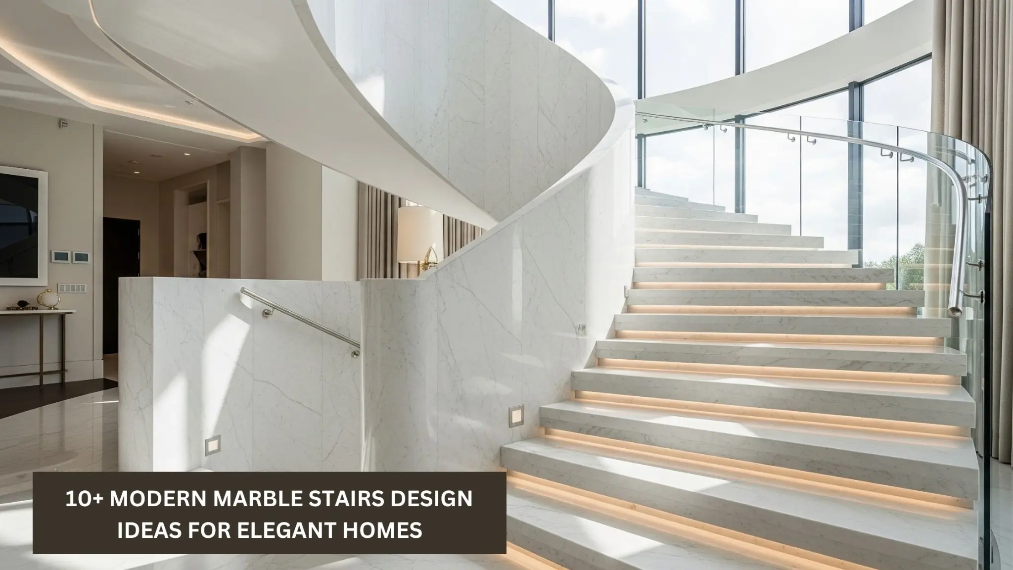
Stairs become easier to read visually when each tread and edge is clearly distinguishable from the next. Stair contrast ideas use differences in tone, material, lighting, or edge treatment to make the shape of the staircase more obvious without requiring a complete redesign.
The key is consistent contrast that identifies the walking surface rather than creating visual clutter.
Make the Front Edge Easy to Recognize
The front portion of each tread is especially important because it shows where the level changes. A contrasting strip, different finish, or visible nosing can help separate one step from the next.
Contrast doesn’t always mean black against white. Moderate differences in lightness can be effective when they remain easy to see under the staircase’s normal lighting.
Coordinate Contrast With Stair Materials
Wood, tile, carpet, concrete, and vinyl stairs each offer different ways to create definition. On wood stairs, a contrasting nosing or runner may work. Tile stairs can use a different edge piece, while carpeted stairs may rely more heavily on lighting and material pattern.
People reviewing residential design inspiration can think of contrast as both a functional and decorative element. A stair detail can look intentional while still improving visual separation.
Keep the Treatment Consistent
If contrast is used on step edges, repeat it in the same position across the staircase. Random changes can make the pattern harder to interpret.
Support Contrast With Better Lighting
Even strong color differences can disappear in poor lighting. Stair illumination should reduce shadows across the treads and avoid glare from shiny finishes.
Ideas from property layout resources can help reinforce the relationship between structure and visibility. Lighting at the top and bottom of stairs deserves attention, but the intermediate steps also need sufficient definition.
| Method | Best Use | Watch For |
|---|---|---|
| Contrasting nosing | Defining step fronts | Loose edge materials |
| Runner border | Carpeted stairs | Pattern becoming too busy |
| Side lighting | Evening visibility | Glare or dark gaps |
| Finish variation | Wood or tile stairs | Insufficient contrast |
Combine Visual and Physical Cues
A clearly visible edge is useful, but the stair should also feel consistent underfoot. Damaged nosings, loose coverings, or uneven tread surfaces can undermine an otherwise thoughtful visual treatment.
Looking at architectural design approaches can inspire subtle material transitions. On stairs, however, decorative changes should not make the tread pattern confusing.
Handrails can provide another continuous reference point. Their color can contrast with the wall so the rail remains easy to locate from the first step through the landing.
Contrast Choices That Can Backfire
Busy patterns can make individual tread edges harder rather than easier to see. Highly reflective strips may also produce glare under direct lighting.
Using contrast on only one or two steps can create inconsistency unless those locations represent a specific transition. If edge markings are part of the design, repeating them throughout the flight usually creates a clearer visual rhythm.
Maintenance matters too. Worn tape or chipped paint may gradually lose both its appearance and effectiveness.
Frequently Asked Questions
Do stair edges need extreme color contrast?
Not necessarily. The difference needs to be noticeable under normal lighting. A strong light-versus-dark relationship may help, but the exact colors can still complement the surrounding interior.
Can stair lighting replace contrasting step edges?
Lighting improves visibility, but it serves a different purpose. Combining even illumination with visually distinct tread edges can make the overall stair shape easier to interpret.
Can carpeted stairs use contrast effectively?
Yes. Contrasting runner borders, stair nosing details, wall color, and lighting can all help. Avoid patterns that visually blend several steps together.
Make Every Step Read Clearly
Stair contrast ideas should make the staircase easier to understand at a glance. Test the appearance from the top, bottom, and landing under both daylight and evening lighting.
Consistent edges, controlled lighting, and an easy-to-find handrail can create a staircase that feels visually organized without sacrificing the room’s design.